Where is my portfolio?
Informational Navigation
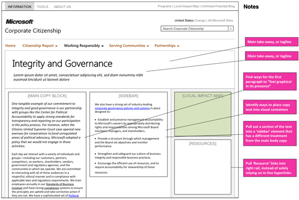
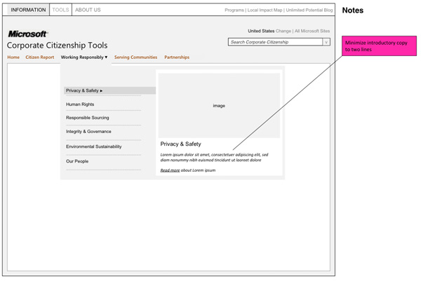
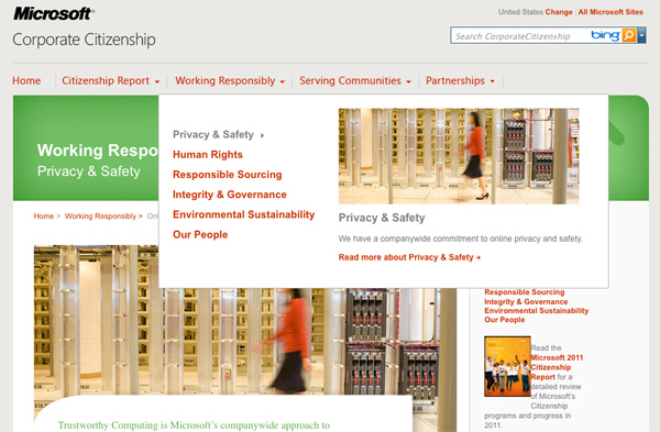
Creating structures to identify the needs of the users for things such as findability and exposure, while meeting demands for product owners almost always pose a challenge. While working on Microsoft’s Corporate Citizenship site, their concerns were that users could not grasp a good understanding of the work that Microsoft is doing to collaborate for human rights and the freedom of expression.
By approaching their concerns directly within the high-level navigation, I was able to satisfy the client’s needs by 1.) bringing more visibility to content in the sub-pages without actually having users visit those pages, and 2.) utilize more imagery from the programs they are supporting.
The reaction towards this type of high level navigation was accepted with excitement, and now it’s live!
Web-based Medical Management
Over the years, a physical therapist-owned and operated partnership of clinics* across Washington and Oregon worked to develop, refine and continue to provide utilization practice management web tools to guide the effectiveness of their clinical care. These tools have become increasingly popular, and are now being used all over the country by other physical therapy networks and providers.
As the popularity of the utilization management tools took off in physical therapy clinics, communicating with insurance case managers became more challenging, as they were using an entirely different system. Working together with UX and Dev, we presented high-level ideas and hopes of developing an interface that insurance agencies would use to seamlessly integrate with the systems already being used in the clinics.
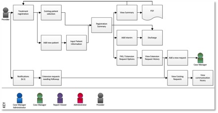
I placed considerations on the design of the interface, but more importantly, on the users of the new system. After flushing through several rounds of user flows, multiple rounds of wireframes were detailed and presented to the client which helped form the shape of the final application. While many challenges were presented, working together and identifying what worked best for the user was always the best answer.
*Due to NDA, the company cannot be explicitly identified. 🙁
Sample User Flows & Wireframes
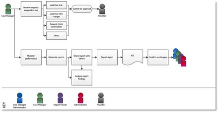
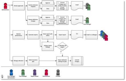
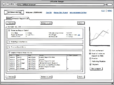
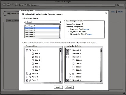
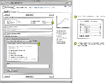
If you’re really interested, a full report can be made available upon request.
Usability Study on LinkedIn
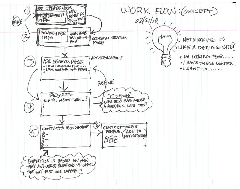 We conducted three research activities that examined existing strategic networking strategies during both in-person and online encounters. The first activity included deep hanging out at particular venues where we observed and engaged with others in a networking environment. The second activity consisted of interviews with people we identified as strategic networkers, for whom part of their professional work was identifying future trends for the benefit of their organizations. Finally we used an unstructured approach in getting feedback from users to gauge how useful our ideas were to their strategic networking efforts.
Research showed the reoccurring concern from users the Profile View (as of June 2010) did not allow users to portray and classify their experiences in ways that emphasize the diversity of their interests and abilities, including concurrent activities. For example, many professionals also are heavily involved in extra-curricular work that would traditionally be at the bottom of a resume, but in fact is very current and relevant. Another concern revolved around higher education not being prominently displayed.
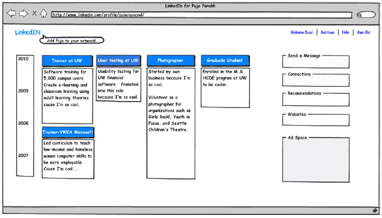
In a traditional resume-based chronological format, as used on LinkedIn, only the current job position is listed at top; extra-curricular activities, active interests, higher education, and even concurrent employment tend to be listed at the bottom. Therefore, we redesigned the way one could present themselves, moving away from the uni-dimensional approach by allowing users to be represented in multi-faceted ways. This allows emphasis on multiple aspects of areas of expertise or interests, which can provide a broader view of a person’s career. We recognized through our research that many people have business skills beyond what their resumes can illustrate, and we hope to allow them greater visibility by including technical skills they may be using elsewhere in their lives. In addition, the issue of maintaining multiple static resumes at a time could be minimized with such a design change. We labeled the profile section of the site as I’mIn, to play off of the site name LinkedIn.
Presenting this to an audience that included usability professionals from Adobe, Microsoft, Google and other area organizations, we received high praise for the timeline view concept, with a lot of empathetic comments from audience members saying, “I can find a use for that!”
More information, including other mockups and user centered suggestions on LinkedIn, can be found here (pdf).
